
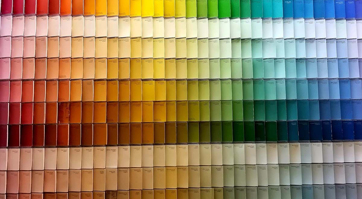
Choosing the right colour palette for a project
Colour influences perceptions and can affect people’s mood, feeling and emotions. Therefore, selecting an appropriate colour scheme for a web or graphic design project is crucial.
Choose the main colour
Before choosing the main colour for your colour palette it is important to consider the industry you are designing for. For example, the colour green symbolises the natural world, health and tranquillity so this would be perfect to use for a National Park Authority. Orange represents energy, enthusiasm and happiness so this colour would work well for a sports or drinks company.

Choose your colour scheme
After choosing the main colour you need to determine the colour scheme that best fits the brief. Colour schemes are used to create style and aesthetic feeling by using colours together. There are several types of schemes which all produce a different feeling.
The monochromatic colour scheme uses variations in lightness and saturation of one colour, providing a clean and professional look. As the colour values are so close together, this scheme is easy to work with and always looks well-balanced.
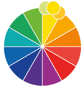
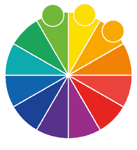
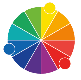
Analogous colour schemes use colour adjacent to each other on the colour wheel. Similar to a monochromatic scheme, but with more contrast, therefore being more vibrant.
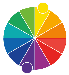
Colours that are opposite each other on the colour wheel are considered to be complementary colours. A combination of one warm and one cold is always created. Complementary colours portray a vivid feel by creating lots of contrast – this scheme is not recommended when trying to achieve a professional or elegant feel.
The triadic colour scheme comprises of 3 colour spaced equally around the colour wheel. Triadic schemes tend to be vibrant and offer a high degree of contrast. This is a popular scheme as it is not as contrasting as a complementary colour scheme and it will allow for balance and harmony.
Tools to help determine your colour scheme
There are plenty of handy colour palette generators available online. Here are some of our favourites.
Without question, Coolors.co is the number one choice here at YCD HQ. It offers a clean interface with a library of pre-set colour palettes and convenient for your mobile phone. The Generator also lets you lock in a selected colour then provides you with an endless amount of colour scheme around your colour. There’s even an option to check how your colour scheme will look to someone who is colour blind – something to consider when selecting colours!
This generator allows you to work straight from the colour wheel using your selected colour scheme. If you have an Adobe subscription, even better – you will be able to save selected palettes for later and share with friends.
Working in a similar manner to Adobe Color, you generate colours off the colour wheel to a palette which displays different harmonies and hues. There is also a randomise button if you’re feeling daring – who doesn’t love a randomise button!
A slightly more niche option that provides beautiful colour palettes inspired by the natural world. If you have a project that requires an organic or healthy feel then ‘Design Seeds’ is certainly worth a visit.
There’s a lot of thought to go into selecting the correct colour palette for a web or graphic design project. If you would like any more information or help with your own project please get in touch with the team and we will be happy to help.