A Golden Opportunity or a Sticky Mess?
We all love a good rebrand, and would argue that sometimes a rebrand is absolutely necessary to keep up with the ever changing times, competition and consumer preferences. A rebrand may also be a fresh start in a difficult market, a way to remind consumers you are still in the game, regain trust from your client base or just to fit in with the most recent trends. Whatever the reason for it, it needs much careful planning to ensure that the branding is both improved and updated whilst remaining loyal to the core of the brand and it’s consumers.
The most recent refresh and rebranding uproar has been from none other than Lyle’s Golden Syrup. Close your eyes and try to remember the unmistakable image. Golden and green. Simple and effective. Brave and familiar. You will definitely imagine the tin and the colours, but do you know what the central image is? This is a surprising rebrand, given that the Lyle’s website mentions that they are a firm believer in the saying ‘If it ain’t broke, don’t fix it’.
Tate & Lyle Sugars is a British company, founded in 1881 by Scottish business man, Abram Lyle. Officially the world’s oldest unchanged brand packaging, as confirmed by the Guiness World Records. Don’t worry though, that title isn’t lost just yet, read on to find out why! For the last 140 years, Lyle’s Golden Syrup has been immortilised with an illustration depicting a deceased lion with flies swarming around it. The tagline proudly reads ‘Out of the strong came forth sweetness’. Said to be influenced by Abram’s religious beliefs, correlating directly to the tale of Samson from the Old Testament. Samson, a strongman, kills a lion with his bare hands and then later finds a beehive in the body of the lion, uttering ‘Out of the eater, something to eat; out of the strong, something sweet’.
Possibly even more symbolic to the brand than the lion image, is their iconic green and gold Victorian-style tin. Over time packaging options have expanded, with more convenient squeezy plastic bottles that make drizzling that sweet, golden, treacley delight over your pancakes or porridge a little bit more appealling and a lot less messy. In a bid to appeal to the everyday British household, without losing any nostalgia and remaining authentically Lyle’s, the more modern versions have adopted a 2024 brand makeover. The new branding still remains loyal to the lion, however this is now simply a lion’s head with a lone bee featured. So the squeezy syrup bottles, dessert toppings and any other tin-less product, proudly display this new, modernised image. It is simplified and abstract in an attempt to make the brand more identifiable and appeal to a wider and more modern audience. The new logo has lost the tagline, however it is still eye catching, playful and almost looks like it could have been drawn using the contents of the Golden Syrup tins, which is a memorable and clever twist on the original concept.
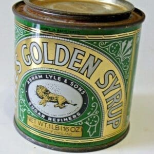
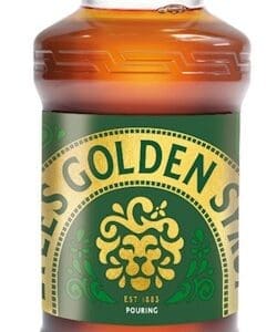
Fear not, traditionalists, all is not lost. The original branding and illustration is going nowhere. It is staying put, at least on the classic green and gold metal tin versions. Which is good news for those who have been up in arms about the change. This clever marketing, means both loyal consumers and new, modern consumers can happily spread that oozy goodness on toast from whichever receptical they so desire. A great way to compromise and keep everyone happy.
The rebrand has been met with some controversy, especially amongst religious groups who believe it diminishes too much from the original story. However, Tate and Lyle Sugars have responded to criticism, stating that the original logo was not directly related to anything religious. Perhaps this new take on such an iconic and long-standing product brand will be deemed by some long standing clients as bee-ing (get it?!) a step too far, but Tate & Lyle stick by the fact that they are retaining their heritage whilst moving with the times to deliver a fresh look. It certainly seems clear that they have tried to bee sensitive, considering all possible opinions on the sticky matter. Perhaps you could also argue that it is also now more appealing to those on plant based diets, as it could have been confusing to have a dead animal on a vegan product…
It does make you think about how rebranding will affect your clients. Many of the most successful companies have rebranded, perhaps even rebranded numerous times. Look at Apple, Starbucks, Instagram, Old Spice and Burger King to name but a few that have rebranded smoothly. Even if the rebrand isn’t exactly successful ( X, I am looking at you), it will get people talking about you. And any publicity is good publicity, right?!
A successful rebrand requires planning, clear communication, clever marketing, market research and sticking to your core values. If you are thinking about rebranding (or just branding..), I am not lion when I say Yellow Cherry are here to help you every step of the way.
Get in touch today to make your branding a roaring success!