

They see me scrolling…
Here at Yellow Cherry, we’re always looking for new and interesting tools to help our client’s get the most out of their websites.
So, recently, we have been investigating a new tool that would allow our clients to view every user’s exact journey on their wesbite. This tool shows us how customers use their site, from where they click first, where they click most, where they hover, what they ignore… genius eh!
This tool could produce invaluable feedback to our clients on how easy, or difficult, their site is to use. Showing what parts of the sites are of interest to clients and what parts are technically redundant. It is a also a cherry useful resource for helping us figure out if there is a hidden problem that isn’t necessarily obvious at first glance.
What is this magical tool I hear you cry. Well it’s hot one I tell you. It’s a heat map to be exact!
We have been experimenting with this tool on our own website for the last few days. It enabled us to view a heatmap of our pages to see how people are using the site, what buttons are most clicked and if we need to move any buttons around so they are easier to find and click.
Here is an example of our homepage heatmap for mobile devices, showing where is clicked and how many times:
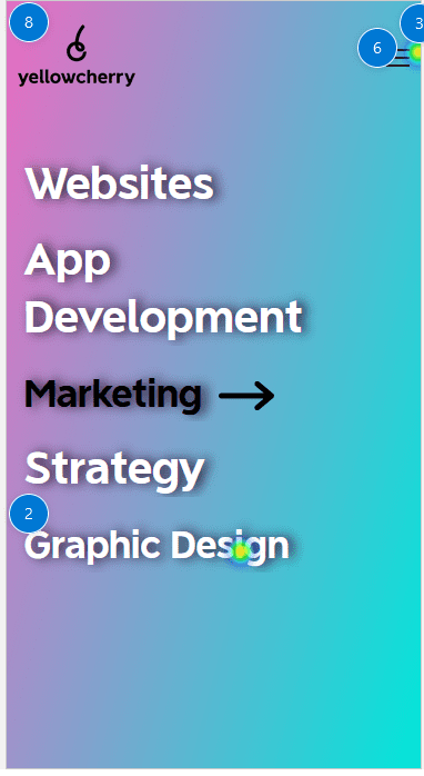
Looking at this, the first thing we can see is that most clicks are on our menu icon, from there they then click on an option within the menu. Perhaps we need to move some options out of the menu and put them straight on the homepage. This would make navigation of our site much easier and smoother for the mobile user.
We can also take a general look at how visitors scroll on our site:
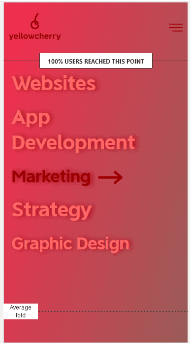
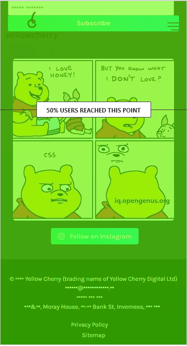
As we can see from here, 100% of people who load our page, look at the top sections (as would be expected!) but then only 50% of those people scroll down the page, where they would potentially see the links to our exciting instagram feed for example. (You don’t know what you are missing, you get much more agency gossip on the social media pages I will have you know!)
This lets us know that we should move more important elements closer to the top of the page where people are more likely to see them. Top tip? Don’t leave any important information in the footer or at the bottom of the page as no one may ever see it!
Take a look at the video below to see more of the information you could be getting from this tool.
Pretty fascinating stuff. Interesting to see that on a mobile device only 5% of those that looked at the job description actually made it to the bottom of the post. Just think of the world of insight on your clients that this tool could potentially bring you!
Next steps
Yellow Cherry is pretty delighted with what this tool can do and is looking to add it to the SEO support package that we offer to clients. This tool can provide a wealth of data for clients to optimize their site and get the most efficient clicks out of it!
If you’re a new or even an existing client and this tool gets you hot under the collar, get in touch with us today and we can look at the options available to you to have this up and running on your website in a jiffy.